Months after deciding on the perfect theme, advisers and their staffs still find themselves spending hours laboring over one thing: yearbook spread design.
If you’re unfamiliar with the term, “spread” refers to two pages in a yearbook that face each other. Since single page layouts are mostly limited to the first and last pages of the book (you know, the ones that’ll be covered up by signatures and messages anyway) there are literally dozens of spreads to design.
Of course, you already knew the yearbook was a bunch of hard work even if it you didn’t know the term “spread.” And that’s why we wrote this post: We do a lot of “how to” on the blog, but this one is all about inspiration.
So, let’s dive in and take a look at five of our favorite yearbook spread designs from students.
What Makes a Great Yearbook Spread Design?
But first… a quick aside.
To make a great yearbook spread, you should follow a similar theme. Ideally, your book will have a theme that’s tied together by design, content, and tone; but tying it together by design alone works, too. If your yearbook theme this year is 1920’s-inspired art deco with a muted color palette, for example, you probably don’t want your superlatives page to be riddled with rocketships and neon typeface; that’d look all out of sorts.
Next, you’re going to want your designers to bring a touch of subtlety to the spreads they put together. The goal of a well-designed yearbook spread is complement the content on the page, not overpower it.
Aside over.
Yearbook Spread Design #1: Pulling Elements From Your Cover
The easiest way to liven up your spreads is to pull elements from your well-designed yearbook cover into the pages themselves. This will create continuity throughout year yearbook while still affording your designers some wiggle room for creativity.
Here’s an example from Oakwood School:

The same vivid pattern from the yearbook’s cover is replicated inside. Notice how a single element of the design has been expanded in order to provide a suitable background?
It creates a pretty powerful aesthetic.
Yearbook Spread Design #2: Incorporating Social Media
Social media in high school yearbooks is a pretty “en vogue” thing. Because, well, high school students love social media. (In fact, we bet if you could submit a lab report as a Snap story, every kid in the 11th grade would ace chemistry. But we digress.)
The trick to adding social media elements to your yearbook is to do so artfully. And that can be a little tough. The staff at Santa Rosa High School nailed it, though:
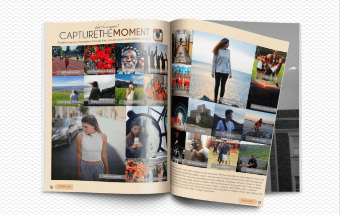
While the overall theme of your yearbook might not have anything to do with social media, you can still tie the content together and package it with a savvy design.
Using a social media platform as inspiration for a page spread certainly yields some gorgeous results, but it serves a secondary purpose, too: Creating engagement. By asking students who aren’t on your yearbook staff to submit their photos you can create a buzz about your book that will carry all the way through the school year.
Yearbook Spread Design #3: Changing Up the Traditional Collage
The collage is a tried-and-true approach to designing yearbook spreads. And while they give you a great bang for your buck in terms of coverage, they can sometimes lack in visual interest.
Not so when the staff at James A. Garfield High School set out to include coverage of its prom in the yearbook:

First off, major props for getting the prom in the yearbook, right? That’s some dedication.
Second, this collage approach is fantastic for one big reason (and a lot of little ones, as well): The variety in how pictures are presented, yet how much structure remains on the page. Using a grid approach for most of the photos provides order and structure, while the cut-outs across the yellow band catch the eye and provide a sense of action.
Yearbook Spread Design #4: Reversing Color Schemes To Create a Pop
Generally speaking, you shouldn’t mess too much with the order created by your yearbook’s established color palette. That being said, rules were made to be broken.
In this senior awards spread, the staff at Garrett High School worked within its color scheme, but did one thing different: They reversed it so that big, bold colors were the primaries. Check it out:

While it’d be a bit much to do this on every page, it’s striking when used once or twice.
Yearbook Spread Design Tip #5: Structuring Layouts for Consistency
This one’s less about addition and more about good, solid design. Often, single yearbook spreads get highlighted outside the context of the rest of the book. But how does that highlighted spread hold up against the rest of the book? And how well does it maintain consistency with the rest of the pages?
Take a look at these spreads from the yearbook staff at Cesar Chavez High School:


Design-wise we’ve got a nice block of text to the left, a smattering of action in across both pages, and additional commentary in the form of captions to the right.
While they’re not exactly the same, these layouts smack of visual order and consistency. In other words, they don’t just look good on their own. They look even better when viewed together.
Conclusion
Finding a little bit of inspiration for your yearbook spread can be as simple as sticking to what works best for your school or changing up the normal way of doing things. It all depends on your goals.
Whichever you choose, though, we bet you’ll find your students are up to the challenge.