Yearbook committees across the country are continuously generating new, exciting, and fresh ideas for their school yearbooks. They work hard to create matchless themes, conceptualize interesting stories, and illustrate attractive design. They are constantly on the move at various sporting events, student activities, and assemblies, snapping pictures, conducting interviews, and jotting down factoids.
However, there seems to be one place where yearbook committees come to a standstill: colors. Many committee members feel limited by yearbook colors. They choose to concentrate on the two or three representational colors of the school, afraid to push the envelope and incorporate a diverse palette.
Color can be the driving force for great design in your yearbook. You can include all the original artwork, well-illustrated graphics, and interesting photos you want… but without dynamic colors, many times these components fall flat.
Straying from the typical school colors can be difficult, but once you start the color revolution there’s no telling where your yearbook will go!
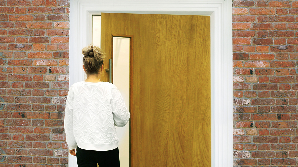
Image source: Flickr CC user LadyDragonfllyCC
It can be difficult to be the first to initiate the color revolution… but no one ever became famous for falling in line – so stand out! Start by organizing important information. Find out if there is a specific look, mission, or goal the school is aiming for this year. For example, in the year 1999, my school decided to deviate from our green and white color palette and create an entirely red-themed book. This graduating class defined themselves as the “end of an era.” Apparently, many years ago, red was one of our original school colors, and therefore, the class wanted to focus on this as a way to stand out above the rest and glorify the class at the end of the millennium.
This mission was definitely achieved. Even now, as I glance at the volumes of K-12 yearbooks sitting on my shelf, I can focus in on the Class of 1999’s iconic yearbook. Its distinctive red coloring truly stands out from the other books’ shades of green and white.
Aim to create your yearbook coloring with the same passion and mission. Look at different color styles. Maybe the overall personality of your senior class is very polished and formal. Use modern coloring as inspiration when planning this yearbook. Perhaps the graduating class is a little more funky and unique, or aiming to remain young at heart. This is a great opportunity to incorporate more playful colors into your yearbook.
Decide how you will use these inspirational colors. Will the new colors be present only on the cover? Will the palette carry on through graphics inside the book? Take the time to jot down a plan, and consult with the yearbook committee to hear their color ideas as well. Planning colors up front will help everyone have a clear vision of the yearbook, and help with individual responsibilities overall.
While color can be fun, make sure to hone in on a few selections – limit yourself to a handful of choices. These should be unified in the fonts, graphics, backgrounds, and borders. When it comes to things like text, make sure that the color is something that compliments, yet stands out from, the background (no white font on a yellow background!).
When it comes to color pages, many committees try to set a limit because of the expense. Because Treering’s prices are reasonable and competitive, you’ll be able to create more colored pages for less, adding diversity and vibrancy to your yearbook.
Even with the additional pages, don’t feel as though you have to make pages all colored or all black and white. Consider mixing colored photos with gray-scaled content. For example, if you are creating the Student Council page, maybe you add in a colored, centralized photo of the officers, while including black and white photos of other council members around them. This will add dimension and interest to the pages.
Use color to demonstrate what certain events were all about. For example, if you had a 50’s-themed dance, it may be interesting to have all of these pictures gray-scaled in the yearbook. This adds to the essence of re-creating that period. The same could go for an 80’s-inspired spirit week. Don’t stop at making the photos simply colored, but rather add filters or color correction to make the vibrant, neon colors pop!
Colors can also be a good way to distinguish sections of the yearbook. Maybe you make the teacher and staff pages the main school color, to show their connection to the overall vision. You could then have different colors for each grade, club, or sport.
The color possibilities are endless! Take time to explore and look for great color combos. You can check out a new art exhibit, flip through magazine ads, or visit a butterfly garden. All of these are great places to find your color inspiration, and get the revolution started!


