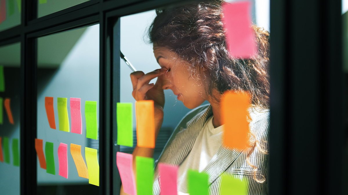
Class portrait pages are essential to the yearbook (in fact, they’re probably what most people think of first), but sometimes they can seem like a sea of faces.
You can break up that sea by laying out your portraits in different ways—and we’ve got several of those unique looks here, gathered together to help you decide what will work best for your portrait pages.
Options for Laying Out Your Portrait Pages
Rule of thumb: if you’re looking to fill up entire pages with portraits, aim for rows and columns of seven. For half pages, try four rows of seven.
These are good guidelines, but there are no concrete rules for portrait pages–you can experiment with different layouts and even create unique looks for each class.
Two things to keep in mind, if you’re going after a ‘nontraditional’ layout:
- Any additional content you add to your portrait pages has the potential to either distract or enhance your photos.
- Really, really plan out just how many pages it will take to cover portraits with a nontraditional layout. Before you start creating the content. Really.
But choose that content wisely, and you’ve got the potential for presenting portraits like your students have never seen before.
1. Alternate Between Full and Half Pages

Pros: Alternating between pages full of class portraits and those filled halfway with faces allows you to fit a large number of pictures on the page, while still having space for additional features. The short article and larger pictures on the right-hand page of this example break up the repetition of faces without taking all of the attention away from the portraits. It’s also helpful if you want to show another side of your students (like an intense passion for the Rubik’s Cube) in your spread.
Cons: This is a clean example, but be wary of trying to cram a lot of additional text and images in this layout, since it has the potential to look busy. It could potentially feel lopsided (though that’s not always a bad thing).
2. Use Only Half Pages

Pros: Filling up only half the page with student portraits makes the spread feel less like an ocean of students. The text and infographics on the bottom half also pull the reader into the page, causing them to pause longer before moving on.
Cons: This layout can take up a lot of pages for each grade, meaning your book may get longer (though you can solve that by eliminating your student life section, since it’ll likely be covered here). The two halves of the spread could also compete with each other, instead of representing a cohesive idea.
3. Fill Every Other Page

Pros: Filling just one-half of a spread with portraits allows each page to stand out on its own, and both pages now look vibrant and interesting. After readers finish digesting the information on the right, their eyes are drawn to the portraits on the left (bonus points for these portraits being arranged like photobooth images).
Cons: Organizing the portraits this way means that the class pages will spread farther through the yearbook. For this reason, this layout may be best for schools with small class sizes—if every student can fit on one-half of each spread, that leaves a lot of room for you to play with accompanying content.
4. Narrow Columns of Portraits

Pros: Corralling the class portraits into narrower columns works well for calling attention to the faces while still allowing for additional mods to be featured running along the edges. In this particular example, the mods are doing double-duty—those faces serve to highlight the students being quoted, but also direct the reader’s gaze to the portraits. That’s some savvy design, right there.
Cons: Depending how text-heavy your mods are, the content might fight with the student names written along the edges. It might also make your portraits feel like they’re surrounded, hemmed in by content that is trying to steal focus. You might have to shrink down your portraits to fit this mod, which can also take away from each individual.
5. Mismatched Portrait Sections

Pros: The mismatched layout keeps the eyes moving throughout the spread. The intriguing structure of photos calls more attention to the page, adding visual interest. It also creates space for additional features to engage readers. This is where a design element from your cover can tie your theme throughout the portrait pages, or it can be a nice home for a mod. We’d also love to see this used where the irregular spacing is taken up by an all-class photo—an opportunity to see the students individually and together.
Cons: This layout has the potential to look messy, and could make the book seem less cohesive or too busy. It may also be challenging to fill the empty spaces to a ‘T’ (though the right mod could fit perfectly).
6. Names Beneath Pictures

Pros: Placing the names beneath each student picture emphasizes the individual more. It’s easier for readers to spot who is who and find themselves in the yearbook.
Cons: Doing so takes up more space, allowing for fewer pictures per page. It also can be a stumbling block when it comes to students with long names, since the name may get cut off, overflow into other students’ space, or take up two lines.
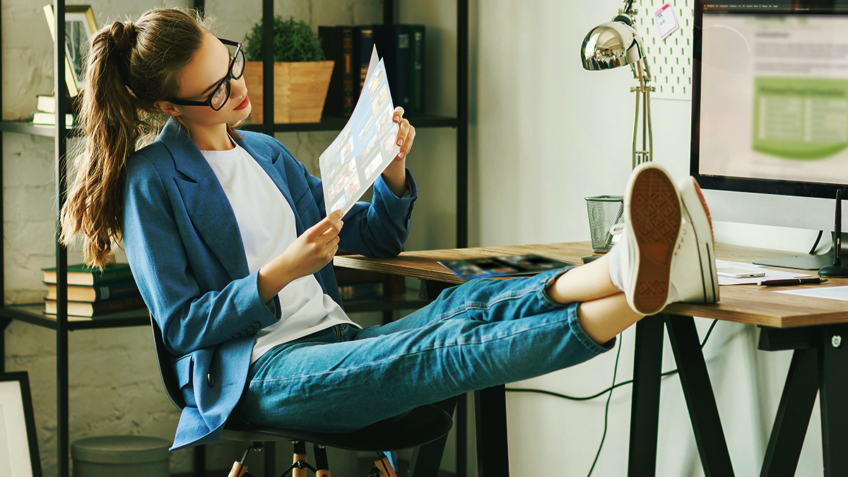
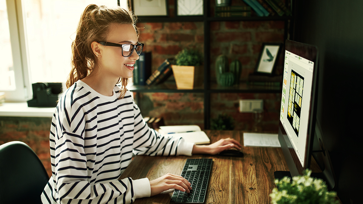
How to lay out your portrait pages really hinges on the preference of you and your staff. If you haven’t left yourself any wiggle room when planning out your page count for individual sections, the standard 7×7 portrait format might work best for you. However, unconventional layouts allow you to get creative with the negative space by adding candid photos, student quotes, or infographics. Keep in mind how many pages you want to use and where you plan on putting student names, but don’t shy away from thinking outside the box. Make the most essential part of the yearbook also be one of the most interesting.