If there’s anything that holds back yearbook class pages, it’s that most yearbook teams rely too much on portraits.
That might sound crazy, but hear us out:
While these layouts need be packed with, well, portraits, the space around students’ faces offers near-limitless opportunity to include interesting design elements. Ignoring that means missing out on ideas like incorporating theme designs, using poll results to create compelling visualizations, or adding student-focused mods to create a more personal approach to the pages.
See where we’re going with this? Class and portrait pages are the bulk of the yearbook. And they’re often the bulk of any boredom.
Inside this post, we’ll break down why class and portrait pages are often boring, what you can do to beat that, and how you can make yours great—with a few examples along the way. Read on.
Why are class and portrait pages often boring?
Let’s face it: Portraits are the lifeblood of your yearbook. They’re the most visited pages of your book—right now and years from now.
Because of their popularity, yearbook teams are often nervous to try something different with their class and portrait pages. And we understand where those nerves come from: Mess up those pages and you’ve messed up the most popular part of the yearbook.
But that’s not the only reason: These pages need to be easy for even the most distracted reader to understand. And since familiarity heightens comprehension, there’s yet another reason to keep things the similar.
The problem, though, is that “similar” is often mistaken for boring.
How to pull off a great portrait page
Now, unlike other foundational sections of your yearbook, you can’t get too creative with the layout and design of portrait pages. They’re expected to look a certain way, and any departure from that will almost certainly lead to grumbling in the hallways. What you can do, however, is complement you students’ grinning mugs with a lil’ somethin’ we in the business call yearbook mods.
If you’re unfamiliar with them, mods are the yearbook equivalent of a sidebar or excerpt designed to support the central purpose of a given page. Think of them like the maps, timelines, and definitions that supplement the dense columns of a history book except.
The students at Garrett High School used a theme tie-in mod to pull their theme, “here’s to us,” into their yearbook’s portrait pages. Check it out:

You’ll notice the standard gridded layout, the names of the students in each row pushed to the edges of the page. But then there’s that small section (making up about a fifth of the page) towards the bottom. In it, students depicted in the portraits above are shown posing, holding blackboards that tell the reader what they’re most excited about.
If you’re not looking to double down in images of students themselves on your portrait pages, you can also tweak the layout of your spreads (slightly!) to make room for small infographics.
That’s exactly what Santa Rosa High School did:
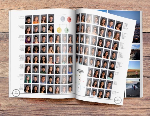
By polling your student body throughout the year, you can give yourself mountains of data with which to create these intricate little visualization. Instead of simply calling out statistics or glomming them all together into their own spread, making them into eye-popping feats of design and incorporating infographics into your portrait pages can help to break up the unending wall of students’ faces.
Just look at the example above: not only do the yearbook mods add to the substance of the page: they enhance its aesthetic appeal, too.
Why a class page is a great idea
On some yearbook teams, there’s a preference to keep portrait pages straightforward. We get that. But even then, there’s an opportunity to tell a fuller story of a class’ year. You just need to use candids along with portraits.
The yearbook team at Oakwood School does great work with this approach, building a class page spread with a journalistic approach that goes before the portraits. The result? A really nice looking, really comprehensive snapshot of the year for those students.
Check it out:

In the bottom left hand corner of the layout you’ll notice a student spotlight section, in which the experiences of one student are captured in both narrative and photograph form. Opposite that, a quote from another student conveys the central reasons for which she loves her school. And between these two unique features, candid shots of students in the class are juxtaposed for a fun yet crisp look.
Is there a better way to dive into the uniform columns and rows of seventh grade portraits? Maybe not.
Class and portrait pages make an appearance in virtually every yearbook ever created, but that doesn’t mean they all need to look the exact same. By incorporating yearbook mods and switching up some key design elements, you can turn these old standbys into fresh, new content that your students will love.